Summary of HACKADAY PRIZE 2022: THIS INTERACTIVE AIR QUALITY MAP MAKES THE INVISIBLE VISIBLE
Ahmed Oyenuga built an Interactive Air Quality Map that visualizes Lagos air quality by lighting acrylic map regions with addressable LEDs. Touching a region turns the color key into a readout. An Arduino WiFi 1010 handles most functions, a custom ATSAMD21J17 board provides capacitive touch, and air data comes from a DesignSpark Environmental Sensor Development Kit with reverse geocoding converting GPS to map locations.
Parts used in the Interactive Air Quality Map:
- Arduino WiFi 1010
- Custom capacitive touch board with ATSAMD21J17
- Addressable LEDs
- Acrylic panels for the map
- DesignSpark Environmental Sensor Development Kit (ESDK)
- GPS module (for GPS data used with reverse geocoding)
- Power supply for LEDs and electronics
- Wiring and connectors
- Enclosure or mounting materials for the map
Air quality can have a big impact on your health, but it isn’t always something you can see. [Ahmed Oyenuga] wanted to make air quality something more tangible and developed an Interactive Air Quality Map.
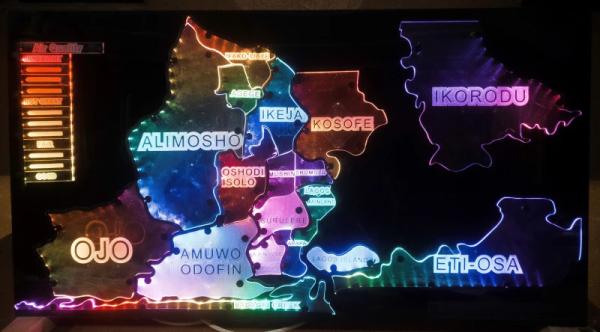
Using addressable LEDs and acrylic panels, [Oyenuga]’s map lights up different regions of his state (Lagos) with colors that correspond to qualitative values of the air quality readings. The color key on the edge of the map becomes a readout when you touch a specific region of the map.
Most of the map’s functionality is handled by an Arduino WiFi 1010, but the capacitive touch is running on a custom board [Oyenuga] designed with an ATSAMD21J17. [Oyenuga] is getting air quality data via a DesignSpark Environmental Sensor Development Kit (ESDK) and then uses reverse geocoding to take the GPS data and turn it into a location the map will understand.
If you’re interested in different options for monitoring air quality that could feed into a map like this, why don’t you check out this LoRa Air Quality Monitor or even a Mobile Air Quality Monitor.
Source: HACKADAY PRIZE 2022: THIS INTERACTIVE AIR QUALITY MAP MAKES THE INVISIBLE VISIBLE
- What does the Interactive Air Quality Map display?
The map lights up regions of Lagos with colors corresponding to qualitative air quality readings. - How does touching the map work?
Capacitive touch is handled by a custom board designed with an ATSAMD21J17, which makes the color key become a readout when a region is touched. - Which microcontroller handles most of the map functionality?
An Arduino WiFi 1010 handles most of the map's functionality. - Where does the air quality data come from?
Air quality data is obtained from a DesignSpark Environmental Sensor Development Kit (ESDK). - How is GPS data used in the project?
Reverse geocoding converts GPS data into a location the map will understand. - What visual components make the map regions visible?
Addressable LEDs behind acrylic panels light up the different map regions. - Can this project use other air quality monitors?
The article suggests other monitors like a LoRa Air Quality Monitor or a Mobile Air Quality Monitor could feed similar maps. - Who developed the Interactive Air Quality Map?
The project was developed by Ahmed Oyenuga.